
I am a graphic designer hobbyist, and as we shared with our Save The Dates, I was all about designing as much of our wedding as I could. So of course our invites were going to be designed by yours truly! There are a lot of angles you can approach your DIY Invites, and A Practical Wedding’s blog does a great job breaking down how to set up a file, what paper types are out there, and more. So for the nitty-gritty goods, they’re your go-to.
For our own process, we asked ourselves:
- How DIY do we want to be? — did we want to take the whole process on, from design, to home printing, cutting paper to size, gluing layers together, etc. Or are we willing to hire some of this out?
- How much Information do we need to share with guests? — We were having a destination wedding, so details on where were critical. We were also having the ceramony at a church, while the reception was at The Inn on Pamlico Sound, so inherently there was more info we needed to include than compared to a wedding at an all-in-one venue. Add in that we planned to host a family brunch the day after, and use traditional mailed RSVPs, and we knew we’d have a few inserts to go along with the invite.
Wedding planning is already stressful enough without fighting with a home printer to get the invites printed just right, then manually cut down, then hand-mounted, then stuffed, then wrapped, then addressed…. you get the idea. In my opinion (and with the wiggle room we had in our budget) I felt spending more on our invitations to limit our manual labor would save sanity when we needed it most. But if you’re already a big fan of DIY card making and have all the fancy materials in your craft stash, then you could easily make these 100% DIY. It’s just all in where your priorities are.
Finding Inspiration
Of course I took to Pinterest to find some inspiration and found this watercolor invite that had a good beachy and still classic vibe. Perfect for a starting point.

I knew I was going to use Cards and Pockets for our invites as they were wonderfully helpful and kind when I designed my best friend’s wedding invites, so I checked out their social media and website too. They even have handy templates you can download or enter your own info into here.
As for the inspiration invite I pinned, I really liked the block lettering for the names in contrast to the script wording, so I took to finding similar fonts that I preferred. I also knew I wanted to incorporate chevron into the invite (obviously).
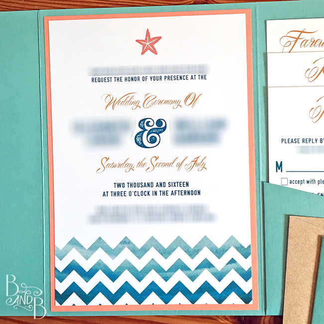
So I fired up Photoshop and first set up the invite per Cards and Pockets’ file specifications, including bleeds as I planned to have my chevron graphic print to the edge of the invite. Then I got to designing including a white chevron layer used to mask a watercolor wash graphic I found online.
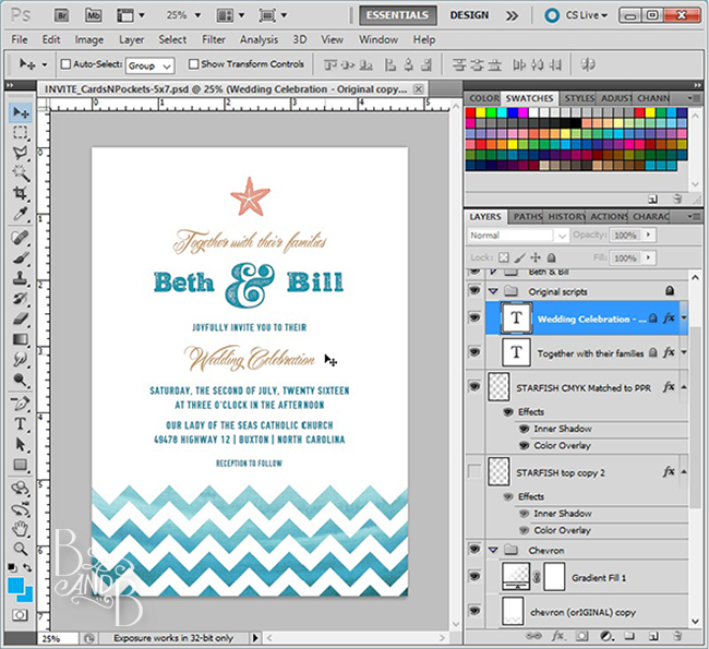
For the actual invite, I did opt to print our full names, but everywhere else it was all B&B. We also ultimately decided to be more formal in the wording – instead of ‘together with their families’ we included our parents’ names together at the top.
Designing the invite was the easy part. What turned out to be a bit challenging was designing the insert cards. I knew I wanted to continue the use of the chevron on those cards too, but if I left it at the bottom of the cards you’d never see it when they’re neatly tucked away in the folder. So, I opted to turn the chevron down the right-side of the cards instead.
To ensure the chevron lined up properly, I first laid out the tallest card in Photoshop per Cards And Pockets’ specs. Then I used some basic math to subtract the difference from the top of each card, making sure the chevron pattern layers were locked. Then it was just a matter of fussing with the details to bring it all together.

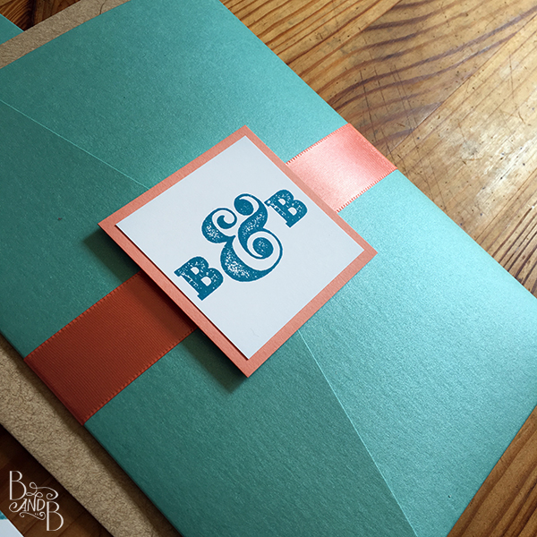
These were designed for use with the 5×7 pocket folder, and included space for a contrasting coral matting to go behind the invite to make it pop, and to coordinate with the RSVP’s coral envelope. BONUS to picking a contrasting and bright color for the RSVP envelope was that it made it stand out more in the folder — and made it that more obvious that guests needed to do something with it. 😉

Here’s the full suite all laid out pretty. We opted to pay Cards and Pockets to do all the mounting – so the invite was glued to the coral matting, then the matting was glued to the pocket. We also paid for our B&B logo to be glued to matching coral matting for the closure of the folder. So all we had to do was stuff the invites with the cards (after numbering the backs in case someone forgot to put their name on the card!) and then wrap ribbon around with the logo closure. Still a little labor intensive, but WAY better than doing all the gluing ahead!
You’ve probably also noticed the seashells and starfish cut-outs in the photo above. I picked them up with the invite order for use on our place cards. We hosted a plated dinner so we had to identify guests’ dinner choice on their place cards. We used the cut-outs that matched our invites (Same papers) to determine if they were Chicken, Beef, Fish, or Veggies. All about keeping things matching!

So that’s how we shared the who-what-where-when of our wedding with our guests. These were also supplemented with info shared via social media like I described in our Smart Phones post. Gotta reach your guests where they are!
What sort of process did you use for your invites? Did you find inspiration online, or completely develop yours from scratch? Anyone else out there use Cards And Pockets?
~ Beth


1 thought on “Our Outer Banks Wedding Invitations”
Comments are closed.